Documentation Index
Fetch the complete documentation index at: https://formbricks.com/docs/llms.txt
Use this file to discover all available pages before exploring further.
Self-Hosting Requirements: Uploading custom background images and brand logos requires file upload
storage to be configured. If you’re self-hosting Formbricks, make sure to configure file
uploads before using these features.
Configuration
In the left side bar, you find theConfiguration page. On this page you find the Look & Feel section:
Survey styling
The Survey styling section gives you granular control over every text and input element in your survey. Expand the Survey styling panel to find collapsible sub-sections for Headlines & Descriptions, Inputs, Buttons, and Options.Headlines & Descriptions
Fine-tune how question headlines, descriptions, and upper labels appear:| Property | Description |
|---|---|
| Headline Color | Color of the question headline text |
| Description Color | Color of the question description text |
| Headline Font Size | Font size for headlines (in px or any CSS unit) |
| Description Font Size | Font size for descriptions |
| Headline Font Weight | Numeric font weight for headlines (e.g. 400, 600, 700) |
| Description Font Weight | Numeric font weight for descriptions |
| Upper Label Color | Color of the small labels above input fields |
| Upper Label Font Size | Font size for upper labels |
| Upper Label Font Weight | Numeric font weight for upper labels |
Inputs
Control the appearance of text inputs, textareas, and other form fields:| Property | Description |
|---|---|
| Input Color | Background color of input fields |
| Input Border Color | Border color of input fields |
| Input Text Color | Color of text typed into inputs |
| Border Radius | Corner roundness of input fields (in px or any CSS unit) |
| Height | Height of input fields |
| Font Size | Font size of text inside inputs |
| Padding X | Horizontal padding inside inputs |
| Padding Y | Vertical padding inside inputs |
| Placeholder Opacity | Opacity of placeholder text (0 to 1) |
| Shadow | CSS box-shadow value for inputs (e.g. 0 1px 2px rgba(0,0,0,0.1)) |
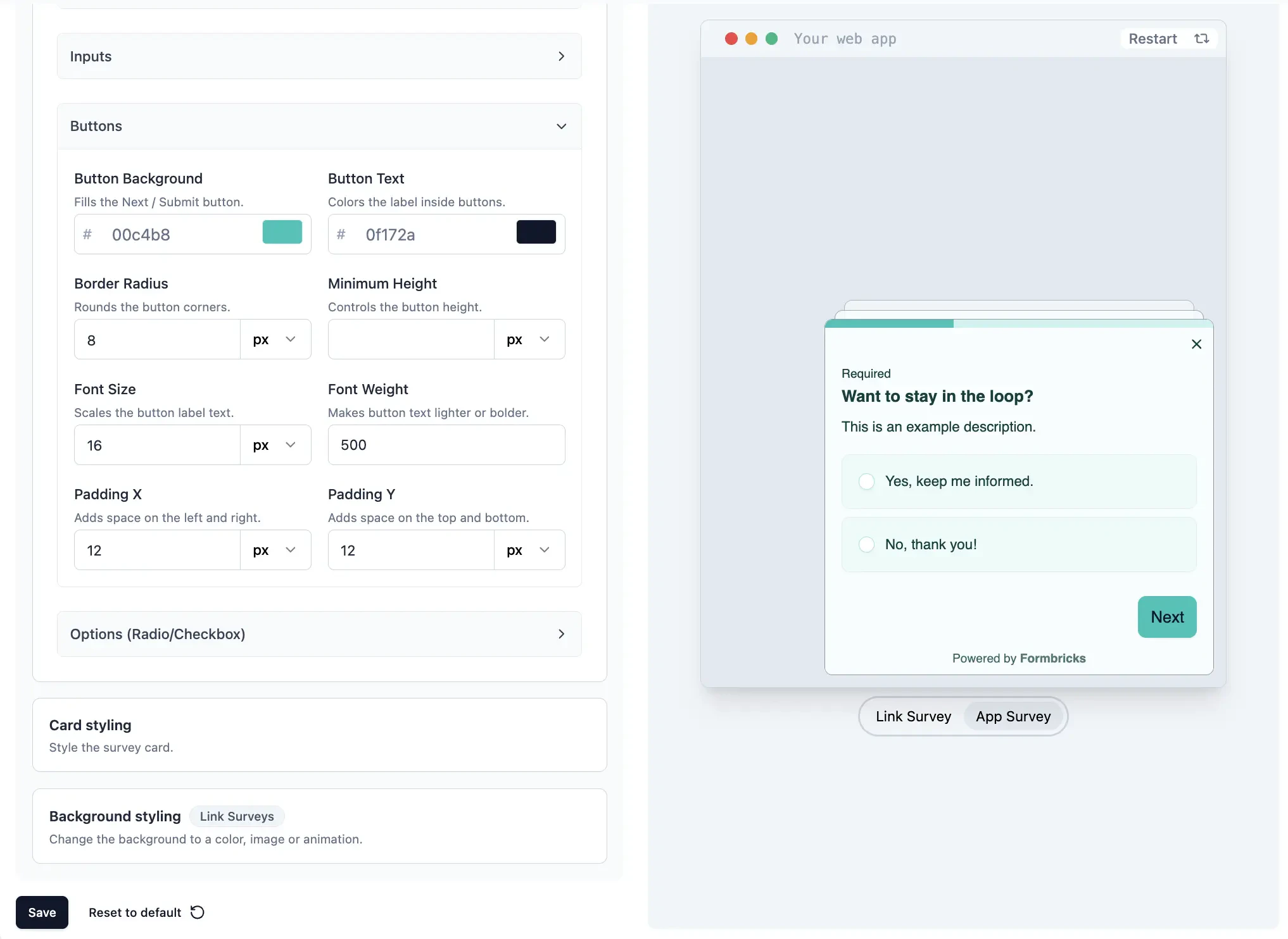
Buttons
Customize the submit and navigation buttons:| Property | Description |
|---|---|
| Button Background | Background color of buttons |
| Button Text | Text color of buttons |
| Border Radius | Corner roundness of buttons |
| Height | Height of buttons |
| Font Size | Font size of button text |
| Font Weight | Numeric font weight for button text |
| Padding X | Horizontal padding inside buttons |
| Padding Y | Vertical padding inside buttons |
Options
Style the select options in single-select, multi-select, and similar question types:| Property | Description |
|---|---|
| Option Background | Background color of option items |
| Option Label Color | Text color of option labels |
| Border Radius | Corner roundness of option items |
| Padding X | Horizontal padding inside options |
| Padding Y | Vertical padding inside options |
| Font Size | Font size of option text |
Card Styling
Adjust the look of the survey card container:| Property | Description |
|---|---|
| Roundness | Corner roundness of the survey card (in px or any CSS unit) |
| Card Background Color | Background color of the survey card |
| Card Border Color | Border color of the survey card |
| Add Highlight Border | Adds a distinct colored border for emphasis (app surveys only) |
| Card Arrangement | Layout mode for stacking cards: Simple, Straight, or Casual |
Progress Bar
When the progress bar is visible (toggle Hide Progress Bar to control it), you can customize:| Property | Description |
|---|---|
| Track Background | Background color of the progress track |
| Indicator Background | Fill color of the progress indicator |
| Track Height | Height of the progress bar track |
Background Styling
Customize the survey background with static colors, animations, or images (upload your own or pick from Unsplash).Background styling is only available for Link Surveys.
| Property | Description |
|---|---|
| Color | Pick any color for the background |
| Animation | Add dynamic animations to enhance user experience |
| Upload | Use a custom uploaded image (5 MB max) |
| Image | Choose from Unsplash’s gallery (attribution shown automatically) |
| Background Overlay | Adjust the background’s opacity / brightness |
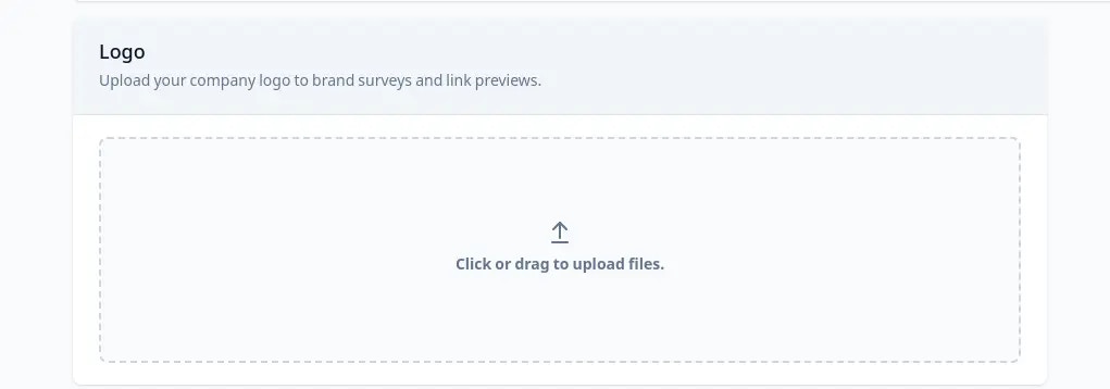
Add Brand Logo
Customize your survey with your brand’s logo.Brand logos are only visible on Link Survey pages.
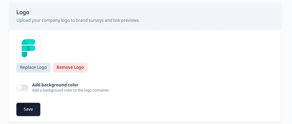
Add Background Color (Optional)
If you’ve uploaded a transparent image and want to add a background to it, enable the toggle and select a color.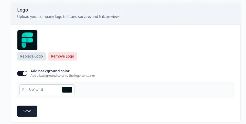
The logo settings apply across all Link Survey pages.
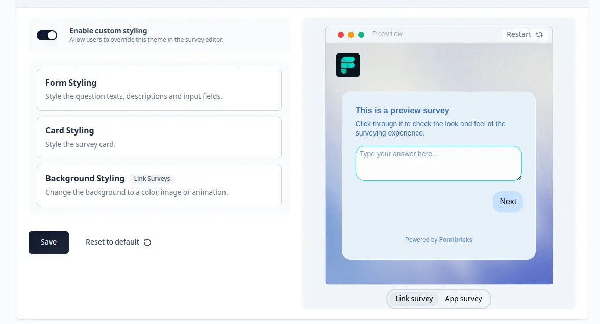
Overwrite Styling Theme
You can allow overwriting the styling theme for individual surveys to create unique styles per survey: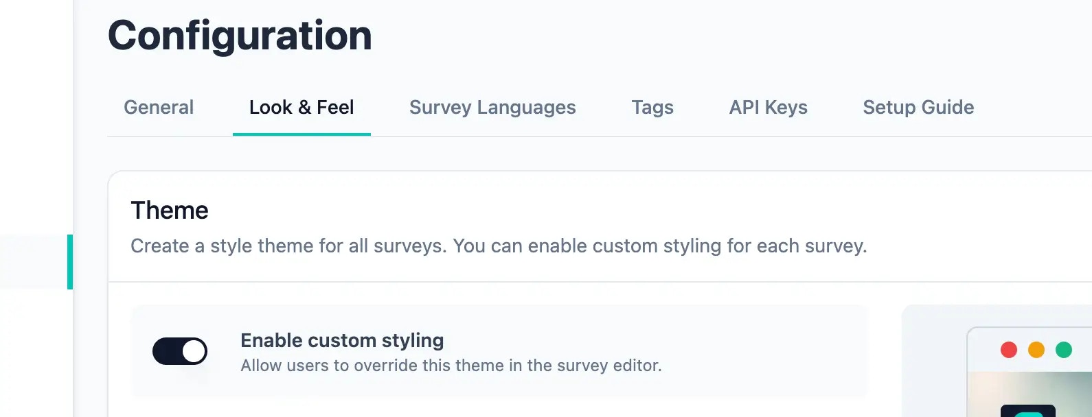
CSS Variables Reference
Under the hood, every styling property maps to a CSS variable prefixed with--fb-. For App & Website Surveys, you can override these directly in your global CSS file (e.g., globals.css) by targeting the #fbjs selector.
See the full CSS Variables Reference in the Custom Styling guide.